logo
design
In my view, an effective logo encapsulates three essential elements: communicability, style, and a hidden allure.
It should seamlessly convey pertinent information, elicit a positive emotional response, and possess a secret ingredient—a double meaning, concealed image, insightful symbolism, or other element—that elevates the concept to a higher, definitive level, ensuring both aesthetic appeal and effective communication.
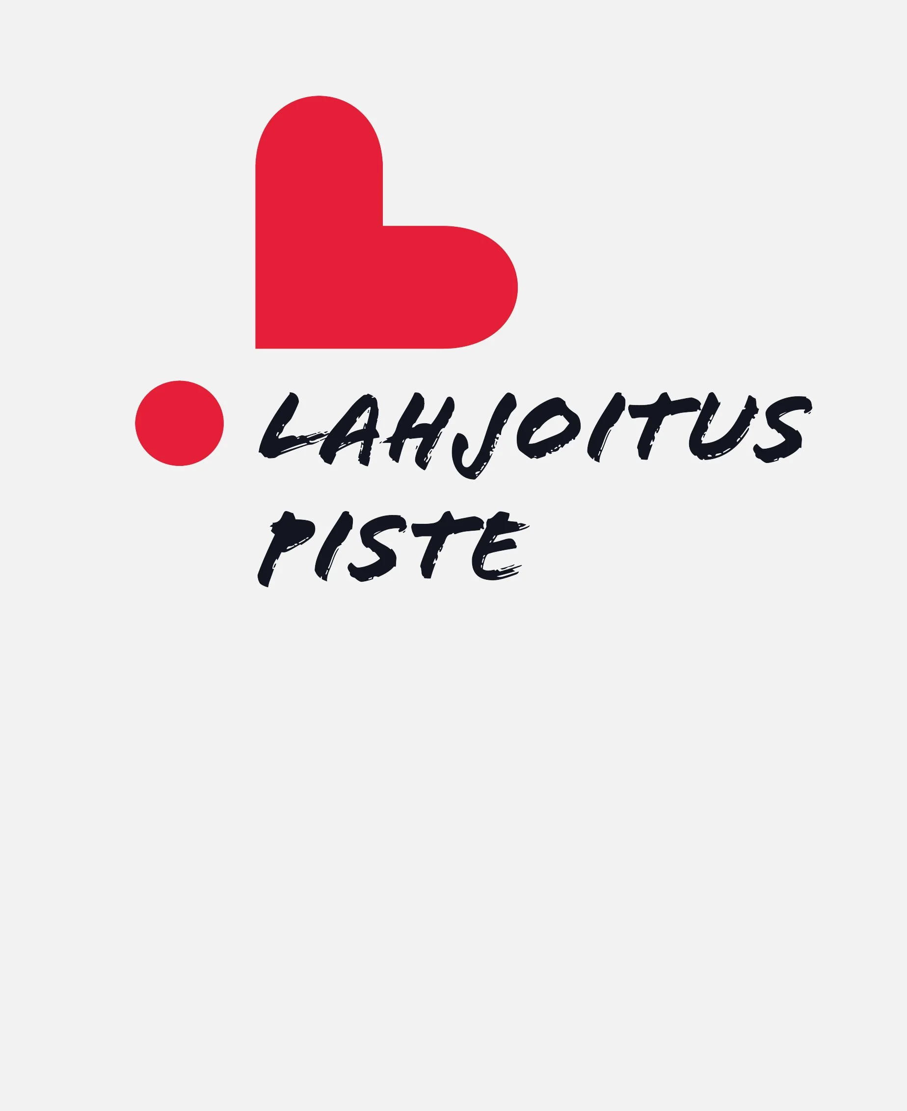
Lahjoituspiste, a novel initiative, unifies diverse donation organizations under one umbrella. The logo features a tilted heart-exclamation emoticon, where the heart, the most commonly used symbol for donating, transforms into an "L" when tilted, representing "Lahjoitus" (donation). The solitary dot within the symbol signifies "Piste," translating to "dot" in Finnish. This design combines symbolism, representing both the act of giving and the company's name, embodying the unity and purpose of Lahjoituspiste.
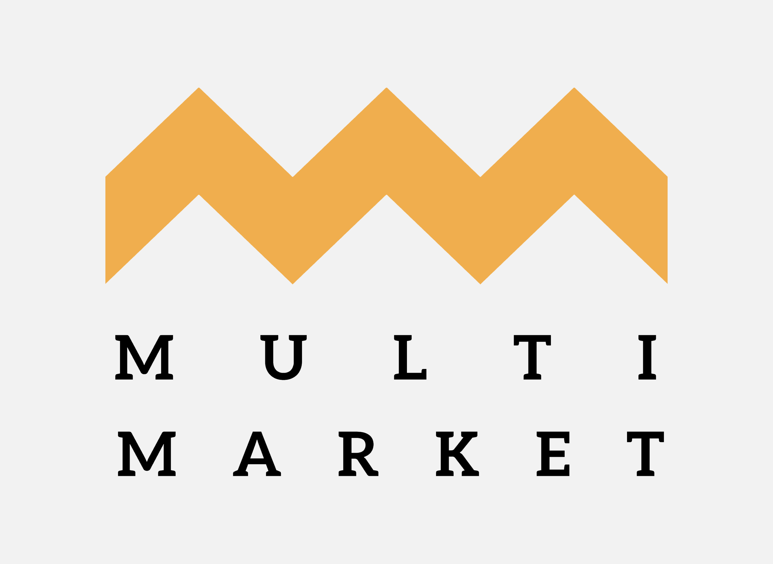
Multimarket, a versatile enterprise catering to diverse customer needs, presents a logo featuring a zigzag element crafted with two M's. Beyond its visual appeal, this element symbolizes the roofs of three market stands aligned side by side. The vibrant orange color pays homage to the traditionally orange market stands found in Finnish market squares. This combination of design elements not only reflects the company's commitment to offering a variety of products but also ties back to the local market tradition, establishing a visually engaging and culturally resonant brand identity for Multimarket.
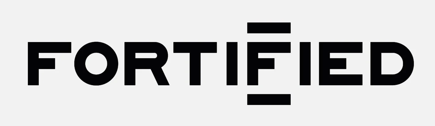
Metal band "Fortified". A logo and symbol that emanate stark and technical ambiance. The design incorporates a blunt aesthetic with a focus on cold precision. The two “I” letters and additional horizontal shapes form a structured framework around the "F," creating a visual representation of fortification. The overall effect is a commanding and visually impactful logo that aligns accurately with the band's metal identity.